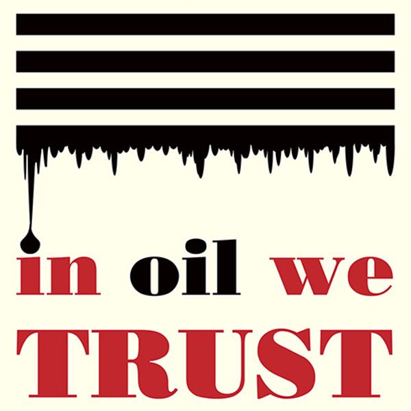
In Oil We Trust
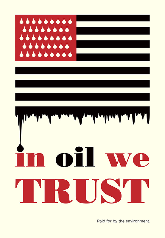
Creative Brief & Design Strategy:
Tasked with designing a minimalist poster about a global environmental issue, I used a limited color palette and simple forms to create an impactful visual message. Red for blood and black for oil shows the cost paid by the world’s dependence on this natural resource.
Can We Build AI Without Losing Control
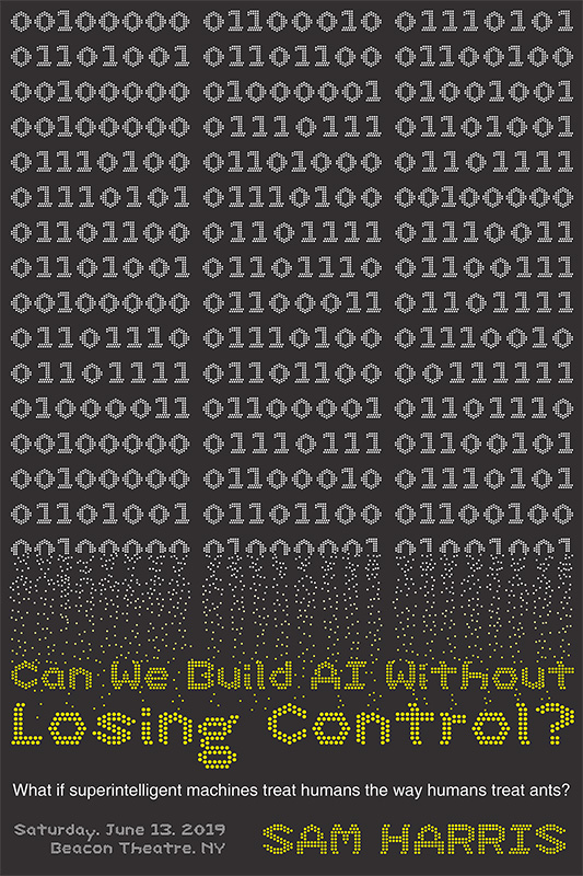
Creative Brief & Design Strategy:
Create a modular typeface using a dot grid and then design a poster based on a selected Ted Talk. The typography limited by the grid had a vintage computer feel, so it was a natural fit for a Ted Talk discussing artificial intelligence. Writing the title using the binary of ones and zeros which de-evolve to fade into the title, I show the loss of control the speaker focuses on using a visual metaphor.
Perverted Too - Beatles Event Poster
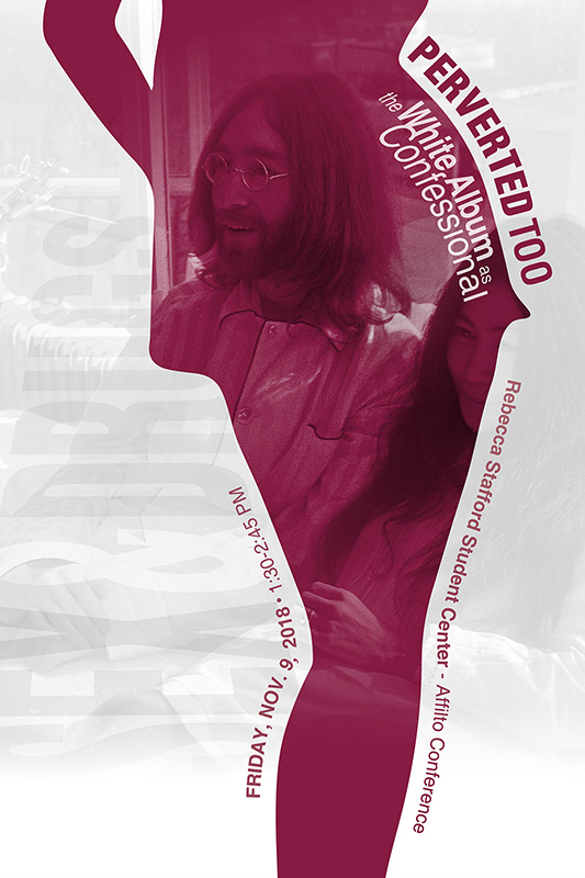
Creative Brief & Design Strategy:
Monmouth University required an event poster for their symposium session on The Beatles White Album. Using public domain imagery, digital illustration, masking, and typography, this poster is informative, while using a provocative form to match the name of the session.
Thoughts on Immigration
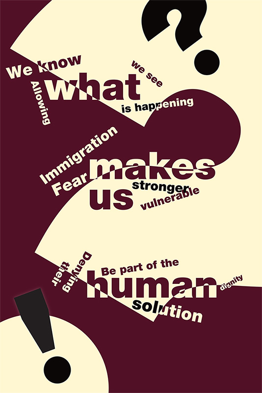
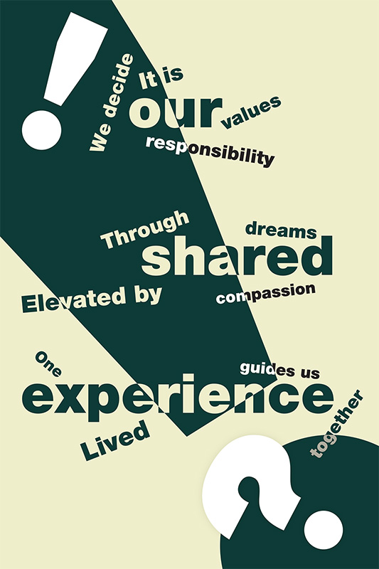
Creative Brief & Design Strategy:
To develop a poster series utilizing only type and color to explore a social issue. I continued my focus on immigration issues to create a two part poster series. The type hierarchy creates multiple reads. The largest type creates the title of each piece, What Makes Us Human and Our Shared Experience. Each word from the title then connects with the smaller words around them to form a secondary read. The staggered placement of the smaller text gives each secondary line multiple reads as well. This forces the viewer to engage with the poster.

